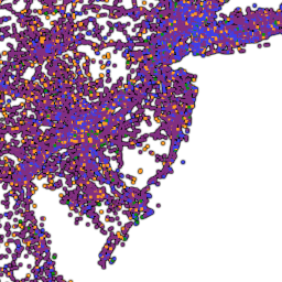
 This incredible interactive map, made by UK-based transportation information firm ITO World, is a great tool to visualize the dark side of automobile dependence. Each dot on the map represents a traffic-related death (fatalities for drivers, cyclists, pedestrians, etc.) between 2001 and 2009; purple dots denote vehicle occupants who were killed. Nearly 370,000 lives were lost in vehicle-related accidents in the time period. Note that New Jersey is absolutely covered in purple dots, although if you zoom in you’ll see a lot of blue pedestrian dots too. Each dot also lists the year of the crash and the victim’s age and gender. You can search for cities, and zoom in to see street-level information on fatalities.
The World Health Organization reports 12.3 annual traffic deaths per 100,000 inhabitants in the United States. Compare that with 3.85 in Japan and 4.5 in Germany. If the U.S. achieved similar rates, more than 20,000 deaths would be prevented each year.
This map is a great tool for community advocates to see where problem spots are at the local level, and to compare their communities to others. In turn, it allows us all to start to realize the life-saving nature of a green, safe, complete system of streets with more mass transit, more sidewalks, more bike lanes, and more walkable development.
